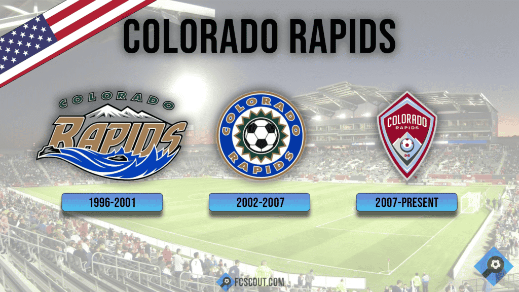
Colorado Rapids Crest
Since the Colorado Rapids’ founding, its image has undergone significant change. The team has gone through two full rebrandings. For the 2003 season, the squad switched from its initial primary uniform color of green to black and blue.

The club reinvented itself once more as Colorado got ready to move into Dick’s Sporting Goods Park for the 2007 season, changing their colors to burgundy and blue and creating a brand-new shield logo to blend in with more conventional global soccer marks. This was done to more closely align themselves with the DNA and color scheme of other KSE teams.
Colorado Rapids Logos
In its history, Colorado has used three different logos. At initially, they utilized the “river” design as their main crest and the “circle” emblem as a backup. The two logos would alternate in 2002, with the “circle” one taking precedence. The Rapids developed the new shield-shaped emblem for the 2007 rebranding, which is still in use today. The number 96, which alludes to the franchise’s inaugural season, and a mountain, which represents the Rocky Mountains in the area, are its prominent elements. The bright golden wordmark was placed in the center of a circular badge that served as Colorado Rapids’ new logo. It was designed with a bold sans-serif with a thin white outline to make the large letters easier to read.
